Showing posts with label vislang. Show all posts

Wednesday, November 9, 2011

Design Intervention: Refined Proposal

During this phase of the project we chose one direction to move forwards in refining and developing prototypes for. Ivan and I decided to move forwards with the guerrilla way-finding direction, which focuses on being able to locate resources. We realized that helping institutions don't advertise their services in areas that are accessible to the people that need it most, so we are creating a way finding system that guides people in the spaces they interact with the most.

Refined Proposal:


Prototype Sketches:

Large bridge sign

Door greeting sign at the end of the journey

Batman-like projection

List of what type of help is offered

Maps placed near crosswalks

Arrows to guide people

Icons to represent the type of help

Design Intervention: Refined Proposal

During this phase of the project we chose one direction to move forwards in refining and developing prototypes for. Ivan and I decided to move forwards with the guerrilla way-finding direction, which focuses on being able to locate resources. We realized that helping institutions don't advertise their services in areas that are accessible to the people that need it most, so we are creating a way finding system that guides people in the spaces they interact with the most.

Refined Proposal:


Prototype Sketches:

Large bridge sign

Door greeting sign at the end of the journey

Batman-like projection

List of what type of help is offered

Maps placed near crosswalks

Arrows to guide people

Icons to represent the type of help

Design Intervention: Proposals

Our final project this semester is design intervention. We are now applying what we learned about communication from our communication models to a real life situation, specifically, the systematic issue of poverty. How can we as designers address a breakdown in communication and propose a solution that will help to make a difference.

However, in order to understand the situation in which we are designing for and to identify a communication breakdown we must research. One way to gather information and experience is through walking in the shoes of the individual through a simulation. So, during class we all attended a poverty simulation sponsored by AIGA and USCAA. During the simulation I played Anne Aber, a mother of three children and wife to a recently unemployed Adam Aber. Taking what we experienced from the poverty simulation our first order of business was to come up with 3 different design interventions.

Proposal 1:

Our first direction focuses on students seeking that are involved in higher education or seeking higher education. During the simulation we saw an example of a student that struggled in providing for his family and how difficult it was to invest both the time and money to locate resources. So we propose a series of educational guides to help students seeking or involved in high education means to decode application processes and to help locate resources.


Proposal 2:

In our second proposal we realized that a lack of communication and organization within the family could be detrimental for their survival and progression. In order to keep the family on the same page we propose a home organization system to manage and prioritize responsibilities within the family. It will allow for good time management across multiple individuals allowing for more things to be taken cared of and act as a centralized hub for family members to communicate/check-in during their busy schedule.


Proposal 3:

During the simulation both of had been adults and so we identified how difficult it was to locate resources and how overwhelming the day to day stress was. Once the first day was over it we didn't have time to rest, we had to figure out a plan of action for the next day. So, for our intervention we propose an environmental or guerrilla graphic series that will alleviate emotional stress spontaneously throughout the day, but also provide information to resources.


Monday, October 31, 2011

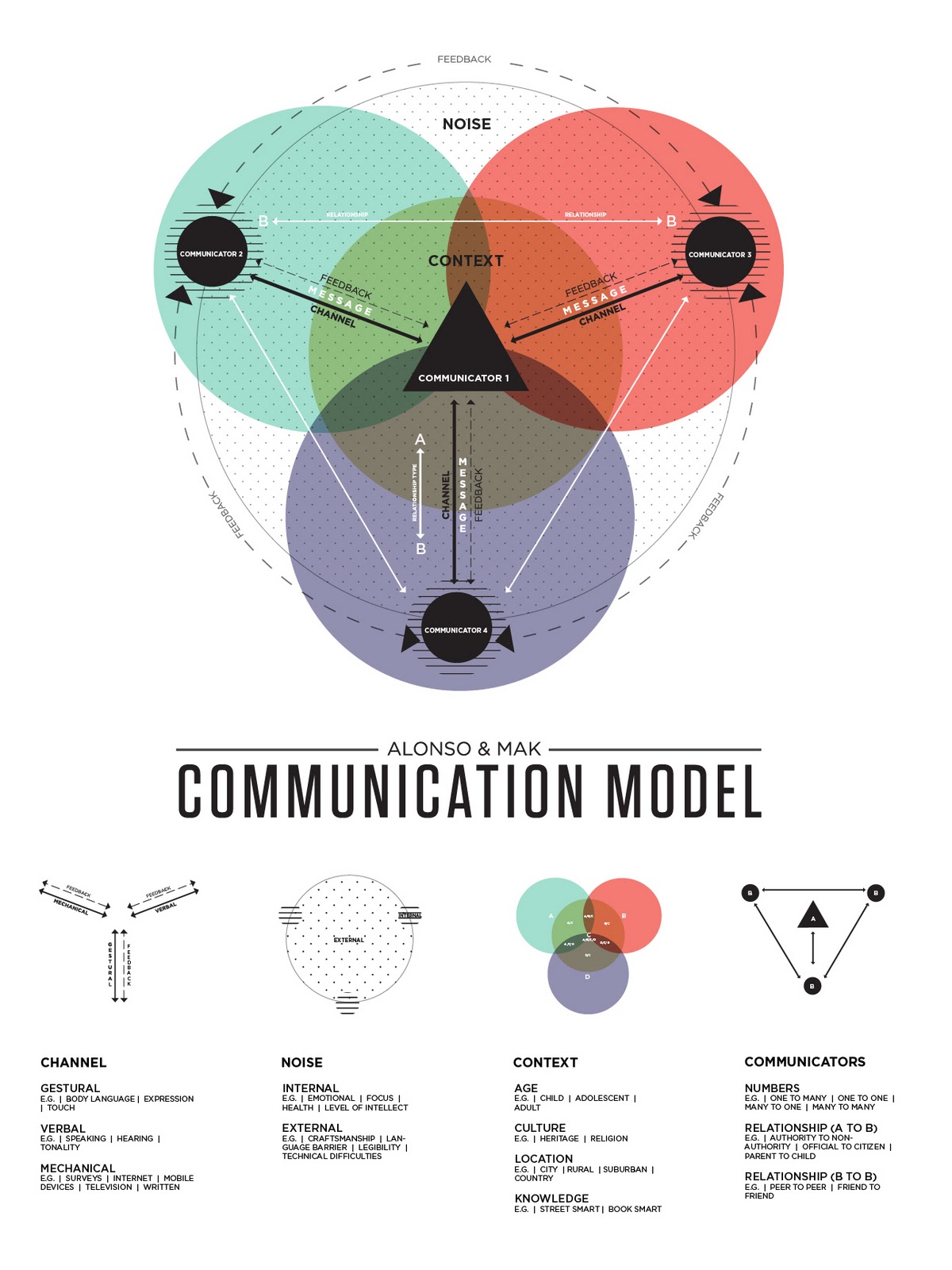
ALONSO & MAK Communication Model : final

Advances in technology has greatly impacted the way in which the people of this day and age communicate. When developing our communication model, Sam and I felt that digital means of communicating in regards to the mass to mass and mass to person relationships were lacking in older models. In order to further explain the complexity of communication and provide in depth examples, we chose to create a key of graphic elements pulled from the actual model to speak more specifically to each topic of communication as well as to provide a quick and slow read.


Saturday, October 29, 2011

Communication Model

Horizontal Version:


Vertical Version:

Monday, October 24, 2011

Package ReDesign


SheaMoisture is a smaller up and coming brand that has a few lines of hygiene care type products. I chose the "shave" series. I specifically focused on their "African Black Soap Facial wash and scrub—beard lifter—cleanse and lift." This product is a deep cleansing face scrub designed for men. It leaves the existing beard clean, soft, and nourished as well as preparing it for the closest shave if that's what is desired. It can be described as a daily beard wash or pre-shave regimen.
The packaging was previously functioning on a ethos mode of appeal. A lot of the Men care products focus on sexuality, logistics, or convincing statements of being the best. I figured if i could play on some humor while staying sophisticated in design, the product would stand out in content and aesthetics.
How?
The epic, wise beard has been placed on the exterior for an initial eye grabbing experience. The motif with the wording subtly references the shape of an old straight razor from an earlier era. The vintage mixed with refined, tasteful, & contemporary styled typography gave the piece the flavor I was looking for. After setting up the visual system it was time for some witty copy writing. I realize in retrospect that it could have been pushed further but the idea was to let the consumer chuckle while surveying the product. The phrasing of facial hair "looks," "deeply rooted," and "Ironically Sophisticated" are my way of slight humor. Tertiary experience?
I thought about having the viewer that spent extra time or even the consumer that spent their money being rewarded in some way. What better way than with laughter. When the package is opened, the inner flap reads "Do not mistake a goats beard for a fine stallion's tail" Kind of funny, yea?

The labeling on the side was once a notation of a series. It seemed perhaps arbitrary and pointless in some way to have a series of packages for the same product. Cool and Fun but unnecessary. So I reduced the facial hairs into an informational icon that says hey, no matter the look, this face scrub is right for you.
The package is primarily in the black and gray area with accents of burnt orange. I feel as if it yields a more sophisticated look. The pop of color is revealed once the package is opened and the bottle is explored. The color is inspired by the cream itself. The facial wash is a white cream with small exfoliating black beads and burnt orange clay beads that organically heal the skin. Thus my color palette of off white, Black, and Orange was conceived.

Thursday, October 20, 2011

Package ReDesign

Monday, October 3, 2011

Modes of appeal: find+share

Logos
These milk cartons have a very minimalistic package design displaying the factual information very clearly and dominantly. The designs are very flat and reduced to only one color per package. This brings the viewer to primarily focus on the package information.


Pathos
Products in the Pathos category often have photos/illustrations that help appeal to the viewers senses. The conversation bubble in this package even helps to speak to the viewer. This rendering is a little more dimensional helping to focus the viewer more on the sensory detail.


Ethos
This package focuses primarily on what the brand offers. Dominate features such as "No Bad Stuff" and "I'm Good, Pick Me Up" seem to guarantee product quality. It plays on the values of the consumer.

Wednesday, September 28, 2011

Product: find+share

PATHOS


The baby wipes are playing on emotion. Thus, its mode of appeal is functioning as pathos. The image of the sleeping baby makes the consumer feel like the product caters to parents that want nothing more for their child than to be clean, comfortable, and calm. Its such a "sweet" and "cute" image. I mean most infant products play up the idea of the children being imagery on the package to pull at the strings of parents. They usually involve a baby or baby and parent showing some kind of emotion. The package material itself is a satin finished wrapper that is soft to the touch reinforcing sensitivity. The colors are cool and calming. The different kind of packaging made this product stand out. Also the level of quality in production made it pop on the shelf. A consumer said that the cool colors and "precious" picture stood out in her mind. The package evoked emotions that would persuade her to buy it for her child. When veiwing it, the front of the package is assesed and then put back down. I guess it has all the main info the viewer wants right on the front. The rounded edges make part of the side blend in as the front.


LOGOS


The product is functioning on the mode of appeal, Logos. Its stripped of all emotion and isn't trying to acquire the viewers trust. It is stating the factual information of the paper. Recycled, 20 lb, 92 bright, 500 sheets. As for the imagery I don't think it is functioning as anything other than a reinforcement of ecology but does not move or persuade me, therefore leaving me at the conclusion of logos. I personally picked this out of the crowd because of the clear, bolded information and bright color choice. It was a lot less busy than the other packages making it feel more refined in design. While observing the consumer, the first thing they seemed to look at was the information located at the bottom right corner. (the lb, brightness, & quantity) When interviewing a potential consumer after a short viewing of the product, it was stated that the thing that he remembered most was that it was recycled paper and 20 lb. The thing that jumped out at him were the bold numbers and bright green color. The imagery of the plant faded in memory. The package was handled by reviewing the front and then flipping it to see the bottom short edge where most info is on paper packaging.


ETHOS


Paula Deen Dressing. This is definitely Ethos. Paula Deen, the popular tv show cook, is endorsing her own line of salad dressings. The consumer is either going to love it because of her name or be leery because of her name. Regardless, the fact that she has a cooking show makes the consumer feel a sense of credibility. If you are into Paula Deen, you'll be into this sauce is basically how it communicates to me. In the setting of the store, the product stood out because of the large image of Paula but in color scheme sort of blended in. Once it was notice though, it was hard to look away. The rich colors and clean typography made it appealing. The bottle said a lot too. A glass bottle always feels more substancial than a plastic one. To me it gives connotations of quality, health, and good taste. When interviewing an everyday consumer he said his initial thought was "cheesy." She was the one thing that stuck out in his head when reflecting on the packaging. He could hardly remember what the product was exactly but he knew that because of her it was something to do with cooking. The color green made him vaguely remember that it was olive oil dressing. Obviously this is ethos if the image of the spokesperson is overpowering content. The bottle was handled by rotation. The viewer looked at the front label and then spun to the right.(probably because we westerners read that way) This made the nutrition facts the last thing to be taken in.

Monday, September 26, 2011

Billboard direction


This is the the iteration that I will be framing my billboard around. Refined iterations coming soon

Folly: Final_Revisions & Billboards


FINAL POSTER (revisions made)

BILLBOARD 1

BILLBOARD 2

BILLBOARD 3

BILLBOARD 4

BILLBOARD 5

Based on feedback from my professors and the Folly folks, I made a few changes to the poster. The main Criticism was that the imagery was leaning too far to the right. There needed to be some more breathing room on the right side. So I took everything and kicked it to the left and refined some imagery resolution. I tried to give the billboards some variation in composition but still tried to maintain a level of cohesion to create an identity for the show. Same type, different lockups. Same imagery, different placement. Overall the same feel. I didnt know if it was appropriate but in some of the iterations I changed the color of the folly logo to tie in better with the composition.

Sunday, September 25, 2011

Poster Process

Friday, September 23, 2011

Final Poster: Mark O'Connor


So this is what I ended up with for the Folly judging on Wednesday. The collage represents not only the instruments that will be played at the show, but is also reminiscent of Mark's multi-talent, and how he pulls from multiple genres to make his own sound. The amalgamation of typography (univers, neutraface, serifa) Hints at the same idea of multiple genres and sounds as well as making the poster relatable to multiple audiences. I felt that the condensed sans serif would appeal to a younger crowd while the serifed type gives the feeling of approachability and age. The color palette is an americana christmas. This is a holiday show. I didnt want to take an obvious color palette and scream christmas. I wanted it to be a subtle hint. The dulled colors relate more towards Mark OConnor and give a mood of his sound.

Wednesday, September 14, 2011

Folly: formal explorations #2


I moved forward with two directions for critique today. The musical collage, and the musical crossroads. The signs are a play between vector and hand illustration. The formal qualities are rustic yet refined like Mark Oconnors Sound. The vector is the precision and the hand illustration and texture is the approachability and rustic. I havent yet decided if i want to fully embrace the holiday color palette or subtly hint at it, or all together throw it out. I do think it will be important to communicate to the potential audience that this is infact a christmas show. Who wants to show up to a bluegrass hot swing, but get a classical americana christmas. I think it will be of great importance for me to let the viewers know whats going on. After critique I decided that the photographic collaging is the best direction. Not only is it more appropriate in formal rendering, it has a better feel of Mark O'Connor. Right now my typography is all over the place. Thats numero uno in moving forward. I plan on locking it in somewhere. Finding a place to align everything will tie the type to image.