
Monday, October 31, 2011
ALONSO & MAK Communication Model : final
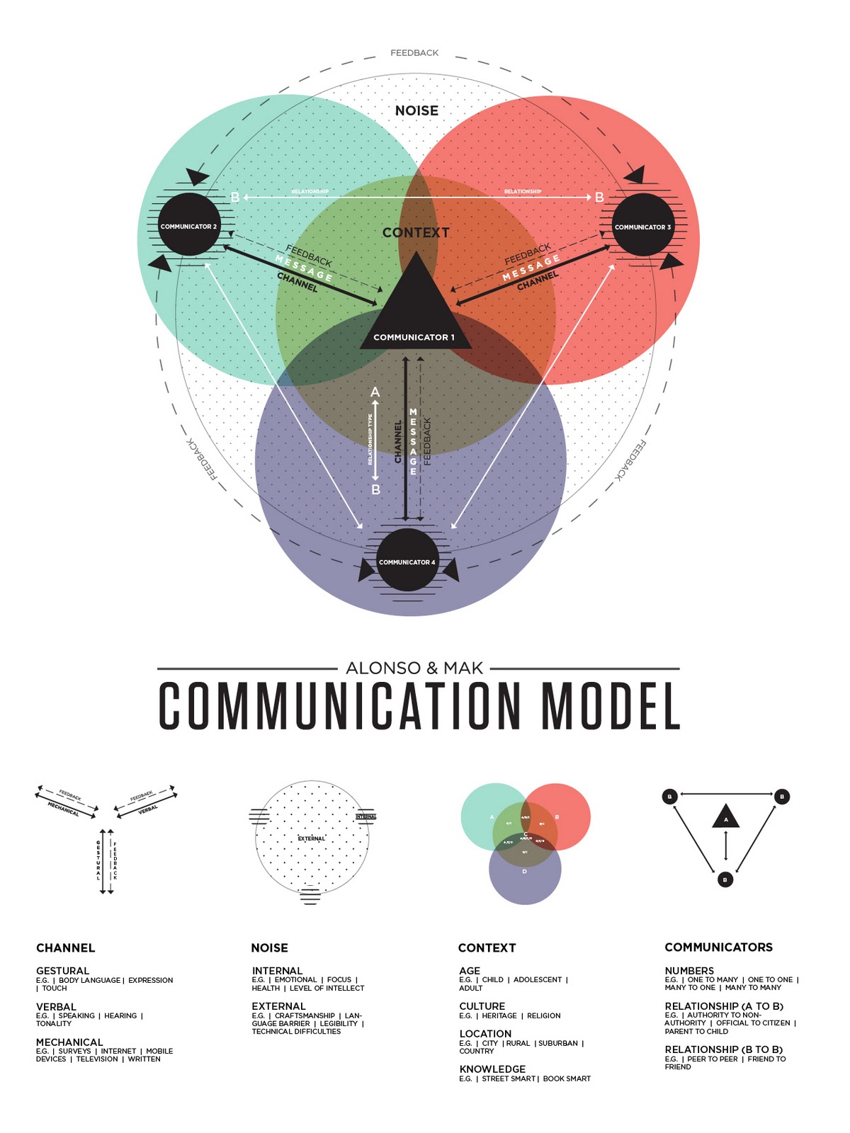
Advances in technology has greatly impacted the way in which the people of this day and age communicate. When developing our communication model, Sam and I felt that digital means of communicating in regards to the mass to mass and mass to person relationships were lacking in older models. In order to further explain the complexity of communication and provide in depth examples, we chose to create a key of graphic elements pulled from the actual model to speak more specifically to each topic of communication as well as to provide a quick and slow read.

Saturday, October 29, 2011


Monday, October 24, 2011
Package ReDesign


SheaMoisture is a smaller up and coming brand that has a few lines of hygiene care type products. I chose the "shave" series. I specifically focused on their "African Black Soap Facial wash and scrub—beard lifter—cleanse and lift." This product is a deep cleansing face scrub designed for men. It leaves the existing beard clean, soft, and nourished as well as preparing it for the closest shave if that's what is desired. It can be described as a daily beard wash or pre-shave regimen.
The packaging was previously functioning on a ethos mode of appeal. A lot of the Men care products focus on sexuality, logistics, or convincing statements of being the best. I figured if i could play on some humor while staying sophisticated in design, the product would stand out in content and aesthetics.
How?
The epic, wise beard has been placed on the exterior for an initial eye grabbing experience. The motif with the wording subtly references the shape of an old straight razor from an earlier era. The vintage mixed with refined, tasteful, & contemporary styled typography gave the piece the flavor I was looking for. After setting up the visual system it was time for some witty copy writing. I realize in retrospect that it could have been pushed further but the idea was to let the consumer chuckle while surveying the product. The phrasing of facial hair "looks," "deeply rooted," and "Ironically Sophisticated" are my way of slight humor. Tertiary experience?
I thought about having the viewer that spent extra time or even the consumer that spent their money being rewarded in some way. What better way than with laughter. When the package is opened, the inner flap reads "Do not mistake a goats beard for a fine stallion's tail" Kind of funny, yea?
The labeling on the side was once a notation of a series. It seemed perhaps arbitrary and pointless in some way to have a series of packages for the same product. Cool and Fun but unnecessary. So I reduced the facial hairs into an informational icon that says hey, no matter the look, this face scrub is right for you.
The package is primarily in the black and gray area with accents of burnt orange. I feel as if it yields a more sophisticated look. The pop of color is revealed once the package is opened and the bottle is explored. The color is inspired by the cream itself. The facial wash is a white cream with small exfoliating black beads and burnt orange clay beads that organically heal the skin. Thus my color palette of off white, Black, and Orange was conceived.
Thursday, October 20, 2011

Saturday, October 15, 2011
Monday, October 3, 2011
Modes of appeal: find+share

These milk cartons have a very minimalistic package design displaying the factual information very clearly and dominantly. The designs are very flat and reduced to only one color per package. This brings the viewer to primarily focus on the package information.

Products in the Pathos category often have photos/illustrations that help appeal to the viewers senses. The conversation bubble in this package even helps to speak to the viewer. This rendering is a little more dimensional helping to focus the viewer more on the sensory detail.

Ethos
This package focuses primarily on what the brand offers. Dominate features such as "No Bad Stuff" and "I'm Good, Pick Me Up" seem to guarantee product quality. It plays on the values of the consumer.
Subscribe to:
Posts (Atom)