Tuesday, November 30, 2010

Promoting Literacy Final Iterations


Last go around I kind of took a step to the side. Maybe even a little step backwards. I started to go in a new direction with the same concept but in fact it muddied the idea. So after getting feedback again I realized it wasn't that I need to push the concept more, I just needed to tweek the details. So this round is all about fine tuning. Each iteration has subtle differences.

Saturday, November 27, 2010

Promote Literacy #3


More progress on some concepts.

Wednesday, November 24, 2010

New Directions


After having a serious talk with my professor, I decided that it was time to let go of the concept I had been gripping for some time. For various reasons it wasn't working nor was it going to be able to progress in a timely fashion. It was both frustrating and nerve racking starting somewhat fresh so far into a project (especially my final) but I feel more confident in the new directions I am taking the project. These are a few of the iterations I've done since Monday evening.

Wednesday, November 17, 2010

Poster concepts


OVERview: Reach Out and Read is an organization trying to promote literacy in America; Specifically targeting comprehension at a young age. The goal is to get Parents to read to their children as early as 8 months old. This will improve the amount of children that are prepared for Grade school. In turn it will also give them a chance to succeed as a student and an adult.

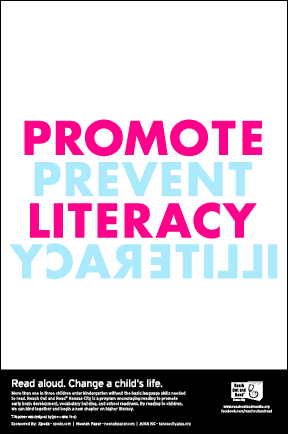
1. These are some concepts chosen from the thumnail iteration phase. The first says illiterate forwards and backwards. The color choice is based on sex. The two colors we think of when talking about boys and girls are pink and blue.

2. The second says "impact." The words are build out of stacks of books. Ideally the photo shoot would take place in a library or the children's section of a book store. Possibly even in a playground. The basis of this is concept. The form hasn't been executed yet. Basically right now its just the bitmap type of form that is being created and founded to make the photo shoot as efficient as possible.

3. The third is an all typographic poster. It lends itself to an infograph. The phrase at the top says "Progression . . . is only possible through intelligence. The rest of the information is about the percentages of children that are read to daily. 36 is low income American families. 48 is the national average. 59 is higher income American families. The facts are sad but true and they are effective in the sense that they communicate that this is a nation wide problem.

4. The final one is about preparing young children for kindergarden. Typographically dominant.

5. There is another concept that isn't up here due to resources. The idea was going to be photographic. The photo would be taken in a library and would show the word READ built into the bookshelf using the spines of the books. Either flipping them around so that the pages were showing or arranging them by color. I tried and tried but kept getting shut down. MJ the librarian was nice but shot down the idea. And the kansas city public library didnt work out. We will see though . . .

Final Revised Motifs


There is a use of repetition and rather sharp geometry in my motifs. This also informs the use of a geometric sans serif in they typographic treatment. I found it effective to have shapes repeated within the motif but not in a "copy & paste" manner. The way I achieved this was by mastering the technique in which the marks were made. This gave me similar results in shape with subtle nuances throughout, revealing the mark of the hand.  In the open shop has a repeated shape made by a price tag. Paper weights on picture books is composed of marks that were made using the spine of three different books. Young springtime breeze is made up of the manipulation of a book page to give wavy, windy like appearances. Each of the analogue motifs were transferred into vector images in illustrator.

Wednesday, November 10, 2010

Taxonomy of Marks: Natural vs Man Made

Jessie, Abby and I have a haiku that considers the natural and man-made.


In the open shop
Paperweights on picture books
Young springtime breeze

The first line automatically denotes man-made.  The second line includes natural and man-made.  The third line speaks to natural.  It's goes from man-made to natural. 


One way we want to classify is create two categories

MAN-MADE   v.    NATURAL
|
|
|
ORGANIC  v.  GEOMETRIC
|
|
|
BRUSH STROKE  v.  IMPRESSION 

(with the impression, it'd be like dropping something or making stamps of it)


Another considerations:
  1. man-made v. nautral --> method of mark making --> medium used
  2. man-made v. natural --> object used --> medium used
  3. man-made v. natural --> organic v. geometric 
Possible Format Sizes & Page/Binding Materials
  1. 8 x 9 in square
  2. maybe put 9 marks per square page
  3. spiral bound
  4. bright white paper to allude to the brightness of spring
  5. using wire-o's like in the book project

Thursday, November 4, 2010

Mark Making


The haiku we ended up choosing was . . . In the open shop, paperweights on picture books, young spring time breeze. After deciding on the Haiku it was time to make marks with the objects that we gathered that were linked to the haiku conceptually. This is some insight to my process.

Wednesday, November 3, 2010

Revisions to weblayouts

Web Safe


The next step in the project was to translate the previous layouts designed for print into a websafe format. This has more limitations such as limited typefaces, specific pixel widths, and point size. The interface in which these are viewed is different than the previous steps of the project. Readability in printed media is different than legability on the screen. CMYK vs RGB. Pixels vs inches. Also the compositions are a lot different due to the orientation of the layout. Moving from a horizontal mind set to a vertical mind set was challenging at first but overall I think I ended up with some interesting, interactive layouts.