Monday, March 28, 2011

Infographics: aesthetics round 1


Book Cover Sketches

series 1

series 2


series 3

series 4

series 5

mapping ideas


1st concept, revised

second concept, revised
Flannery O'Conner short stories. The covers will eventually be designed as iPad & e-reader cover pages for the books. They are based on three stories. Good Country People, the Life You Save May Be Your Own, and A Good Man is hard to find. Through out the series of short stories there are underlying themes of religion, deceit, and Hypocrisy. Playing off of those ideas I am focusing my covers on dualities. some are more ironic than others but the concept is based on the ideas of things not always being what they seem. Theres a selfish christian, a loner that rejects redemption, and a scholar that is robbed.

FIND + SHARE

I find this info graphic interesting on numerous levels. First off the color palette caught my eye. Muted earthy tones have a special spot in my design heart. The typography is working quite well also. The way the header is set pleases my eye. The variation within that set block of type is engaging. This is because of the contrast used in the type. The extreme shifts in scale and weight allow the composition to leave the static realm. The shift in scale with the icons is nice as well. The combination of the illustrated ships and abstracted oil drop is communicating great.

Reading + Find&share

The reading in Graphic Design the New Basics, Info graphics are described as diagrams. Diagrams are graphic representations of a structure, situation, or process. This relates to our lecture about spacial, temporal, and quantitative information graphics. Visual relationships/Graphic marks take on meaning when paired with numbers, scale, connections. For instance, the splooshy mark on the infograph above doesnt really mean anything. But once it is paired with the numerical information, a title, and scaled according to the data, the splooshy mark makes sense and we can draw the relationship between the elements, realizing that the mark is an oil droplet. This all seems so obvious and rudimentary until information graphics is a task you, the individual, has to take on. I myself struggled while working through ideas. Visualizing data in a way that makes sense to a mass of people and not just in your head is a hard concept to grasp at first. I think its about starting simple. Nothing extraneous. Design and form should derive from concept and data. Tufte refers to all the fluff in a diagram as "chart junk." Whats the old saying . . . without concept (data) design is decoration? something like that. Heibert has 6 steps of graphical integrity that really helped me work through some infographic skeleton frames. Proportional correspondence, data-ink proportionality, clear labeling, contextual relevance, device relevance, and shape relevance.

Sunday, March 27, 2011

Progress on Infographics


screen grabs of the current stages of some info graphics before crit.

Saturday, March 26, 2011


So after critiquing with Tyler Galloway, some things were brought to mind. We discussed the idea of the assignment and where to move forward. The first three images are the latter part of my poster itterations. The Fourth image is a new poster concept stepping in the direction I want to push the Posters. Tyler said, "remember, this is supposed to pay homage to your artist. You do Neville well, but where does Ivan Alonso meet Neville Brody" I am on a search to find that happy medium. For this I am spending more time with his album artwork for inspiration. (images 5&6)

Friday, March 25, 2011

Wednesday, March 23, 2011

Infographic Skeletons


Moving forward from the Sketches into skeletons. After re-evaluating my research and data, I have changed up some of the sketches and info graph concepts. I was really stuck on quantitative thought and forgot about qualitative spacial and temporal compositions. The sketches just were not working on monday. I think they are starting to get somewhere conceptually. Next step . . . AESTHETICS!

Monday, March 21, 2011

infographic sketches


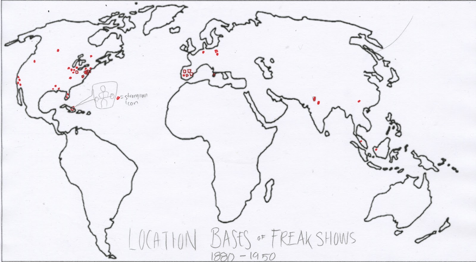
1. sketch one is mapping out where various freak shows originated before they started traveling. The icon used would be the strongman icon.

2. sketch two is showing the most visited cities by freakshows and the different travel patterns in one "show season"

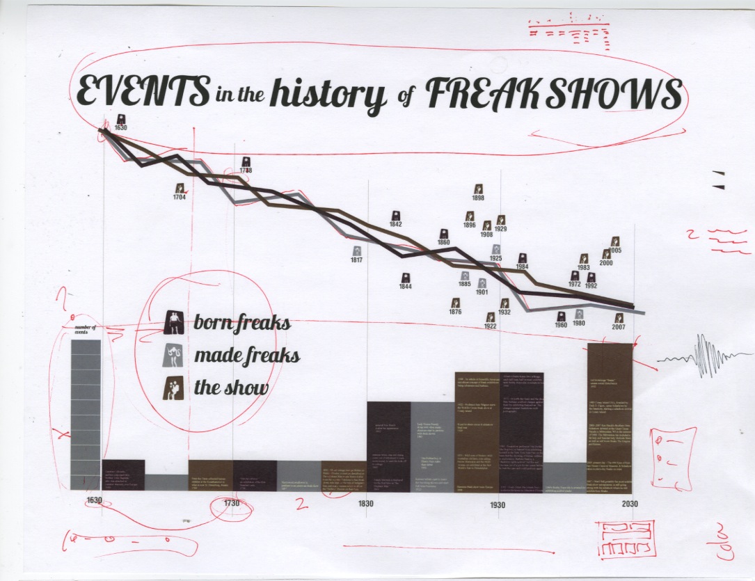
3. sketch three is a timeline of the evolution of the sideshow and how it came to be over time.

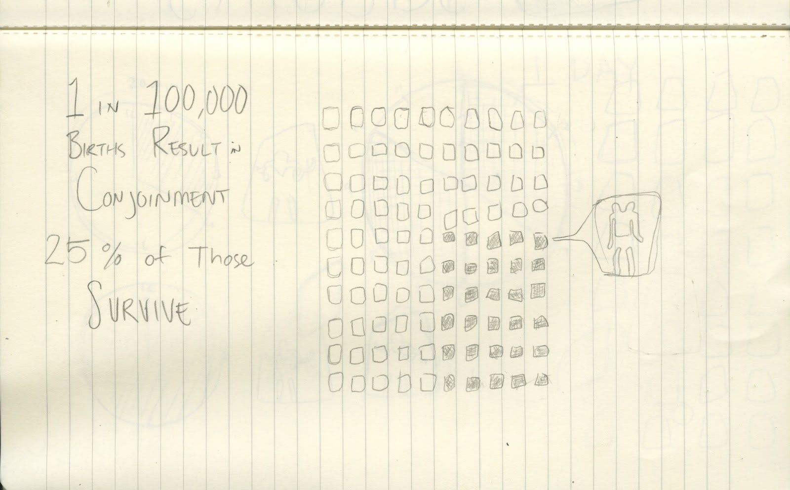
4. sketch four shows the rate of survival in Siamese twins

5. sketch five is graphing the ratio of 1 to 100,000.

6. Types of conjoined twins

7. numbers of swords swallowed at one time by a single performer

8. the rate of survival in siamese twins

9. Performance time. performers go on every 20 minutes. two times an hour. 32 times a day. these are averages.

sources:

http://en.wikipedia.org/wiki/Ventriloquism

http://www.nfa.dept.shef.ac.uk/history/shows/freaks.html

http://www.sideshowworld.com/13-TGOD/ths-tgod.html

http://www.circusinamerica.org/public/transportation_modes

http://en.wikipedia.org/wiki/Conjoined_twins

http://en.wikipedia.org/wiki/Freak_show

http://books.google.com/books?id=hr-9GRxJfPEC&pg=PA51&lpg=PA51&dq=freak+shows+in+1901&source=bl&ots=N3TGBgX9Yw&sig=sQpsCMqsJhPQNkGmOlpYvMveatk&hl=en&ei=ISaETZmjJYaUtwfbg4jdBA&sa=X&oi=book_result&ct=result&resnum=1&ved=0CBgQ6AEwAA#v=onepage&q=freak%20shows%20in%201901&f=false

http://www.lastamericanfreakshow.com/

http://en.wikipedia.org/wiki/Sideshow

http://en.wikipedia.org/wiki/Conjoined_twins

http://www.swordswallow.com/records.php

http://www.swordswallow.com/halloffame.php

http://www.circusinamerica.org/public/structures