Sunday, August 29, 2010

FIND + SHARE

Find and share time. So, during First Fridays I stumbled upon this printing press in the crossroads. Vahalla Studios does some good work. Vahalla Studios is a collaboration between Tad Carpenter and Dan Padavic. Super nice guys.

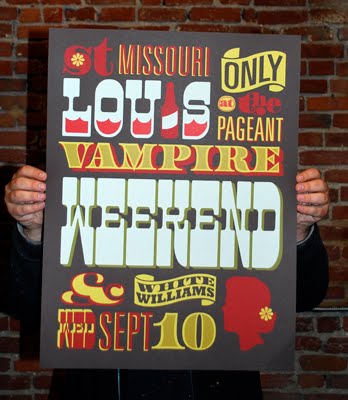
Alignment- This seems to be the most evident principle of design in this poster. The type varies but the words are aligned with one another in blocks of space. St. Louis Missouri is contained in one block. Only at the pageant in another. Vampire weekend in one and then the date and opening act in another. In a larger sense the poster is broken into thirds. 

Framing- There is some framing going on in Louis. The "i" is the bottle and the liquid contained in the rest of the word. On a larger scale the composition sits in a rectangle smaller than the page, leaving a frame of gray.

Asymmetry- This composition isn't screaming asymmetry but its there. Balance is maintained here through the weight of each visual element. The flower in the girls hair is mimicked in the "s." The weight of the head is balanced in "st." The ampersand counterbalances the banner with the word "only" in it. The business of the top right corner is balanced in the bottom left. "Weekend" occupies the same amount of space and visual weight as "st" and "vampire" put together.

Scale- It is pretty obvious where this is happening. Some words are larger than others.

Positive/ Negative- The gray background is assumed to be the negative space. In the banners that say "only" and "White Williams," the negative space is used to create the type.

Totally cool poster. Nice design. End of story.

Reading and Video Response

Meggs

Design is everywhere. It is everything. Our eyes are flooded every second with visual information. There is one sentence in the article by Meggs that sticks out in my mind. "It transcends the dry conveyance of information, intensifies the message, and enriches the audience's experience." The last paragraph gets me excited for the journey to come. The further our culture evolves the more power we have, visually. We are the people feeding society information. We choose what they pay attention to through our designs. 

 Hiebert

In this article, the section about style is particularly interesting. It is true that style can get in the way of communication. As visual people it easy to get caught up in the beauty or hipness of a design rather than focusing on the information being conveyed. Also it is important to understand the audience that the information is for. Certain styles turn individuals away for one reason or the other. It is tough to find the middle ground sometimes. Also this article brought some new ideas to mind. I hadn't thought about graphic design being an interface. The way he explains the concept is intriguing. The idea that if we don't like a design it isn't the information we dislike, its the interface or output we dislike. 

Sagmeister

This dude is awesome. I am a fan of his work and have followed him for a bit. I admire his drive and determination. It is evident in a lot of projects he takes on. The dedication it takes to cut words into your body to make a visually commanding image is beyond me. Also the one where he eats all of the stuff is crazy. 25 lbs in one week. That is like 3 lbs a day. SICK. But its all for the design. Stefan s a great contemporary designer. 

Abstractly Communicating

thumbnails

thumbnails

affection

unity

growth


Assignment: Communicate concepts, abstractly of course, using less than 10 black dots in a 6x9 frame.

Process: I gathered all of my concepts on paper using thumbnail sketches. 40 thumbnails. 3-4 per word.

I was pleased with the designs for the three final compositions. My goal was to convey the concepts clearly through clean and simple designs. I didn't want to overwhelm the viewer with too much information. I found it difficult to stay on the abstract side of the spectrum while staying minimal in design. In "growth" the dots are aligned and spaced evenly. The only thing changing is the size relationship of the dots. The concept behind "affection" is family. The two larger dots slightly overlapping represent a mother and father. The four smaller dots following symbolize the children. I wanted the dots to touch enough to show that they were a family but separated enough so that they did not become a compound shape. "unity" has a few problems. If I could I would change the spatial relationship. The space and arrangement suggest a burst now that i look closer. If the dots were tightly knitted together it would more clearly convey "unity." Also let it be known that cutting perfect circles is a difficult task. Investing in a crafty circle cutter would have made for a less stressful night.

Thursday, August 26, 2010

why design?

Growing up i always had an interest in the arts. As a youngin' i didn't think i would make a career out of it but i guess i just couldn't see that far into the future. Through out high school I planned on being a print maker. All of my work was fine art based. Painting, drawing, printmaking, etc. Senior year of high school my portfolio changed significantly an i decided to apply to colleges with graphic design in mind. When i saw how strong the design department was at KCAI it was a done deal. I made up my mind, packed up all of my stuff ,and hit the road. Secondly, typography is such a beautiful thing. Nothing can explain how excited i get when i see new type faces or recognize a sign on the street or a package in the store. Design is everywhere and i want to contribute to the creative world while having a career. I love problem solving aspect that design has. I enjoy having clients and "projects." I think what attracts me to design the most is that it has limitless career opportunities.