Showing posts with label viscom2. Show all posts

Monday, April 18, 2011

Retail & Interaction

Brainstorming about possible items in the gift shop and interactive exhibits within the museum exhibition.

-Penny Smasher ( 51 cents for a freaky penny!)
-Play swords
-Recreated vintage illustrated posters.
-Bearded Lady Dress up Photo booth
- Fortune teller booth like Zoltair
- Test your strength carny game
- Bed of nails
- Fake coals to walk on. (mildly warm just for fun?)
- Stuff a sword down a fake throat. Don't flinch. The slightest move can sound the buzzer "killing" the sword swallower ( based off of OPERATION)
-Striped contortionist unitards. Strong man leotard?
-Learn how to be a pincushion. (learn where to poke and how, then have at it with a ballistics gel figure)
-Crawl through a huge model of the sinus cavity. The part of the body that human block heads shove nails and screw drivers in. ( crawl space is targeted toward, but not exclusively for children.)
- Download-able App called Freakomatic? Freakstagram? Instafreak? sideshow photography? anyways itd be a simple iphone app that allows individuals to take pictures of individuals and have them converted into a bearded lady, elephant man, boil face, pinhead, etc. (think about the fat app to visualize this)
- the elastic man/ contortionist. Body parts will be casted in elastic type rubber material and mounted to the wall available for twisting, turning, stretching, and molding. 

Tuesday, April 12, 2011

Possible concepts for Exhibit

1. Objective look behind the scenes
title- Conundrums
description- A look at the genetics of born freaks as well as explaining the science behind the fantasy of made freaks. Solving the mysteries of the show.
2. Family, togetherness, and loyalty
title- carny kinfolk
description- An exhibition of the family life in the culture. showing famous couples of the freak show. 

3. Looking at freaks' lives after the shows are banned
title- The show must go on
description- Some freaks were able to twist their careers into something acceptable by human right activists while others were just out of a job.

Wednesday, April 6, 2011

infographics: meeting objectives


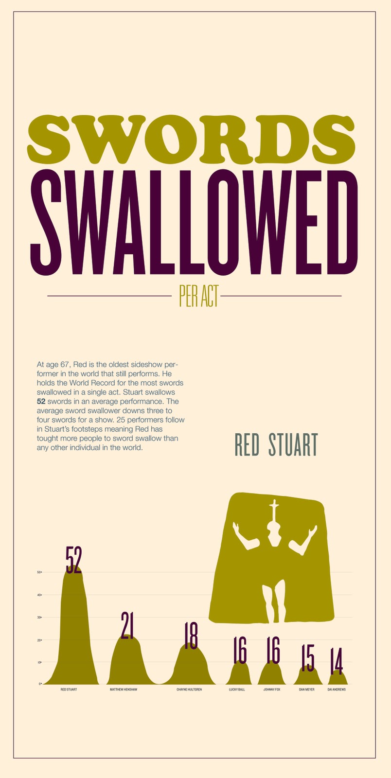
Info-graphics revolve around information. The core of an interesting information graphic is interesting information. Seems obvious and easy but its actually quite difficult. A lot of research was required before aesthetics could even be considered. I struggled with the research a bit towards the beginning. I searched high and low for good information but the cultural time period is talked about so vaguely and generalized so much that quantitative information often was non apparent. It was suggested that I start looking at qualitative information and trying to visualize that before jumping into numbers that did not exist. Needless to say, after a long journey I finally found the information I needed. As far as visualizing the information goes, I considered a lot of variables. The info graphics shown above have evolved formally and conceptually a great deal since the beginning. It was hard to find the balance between aesthetically pleasing decisions and informatively confusing decisions. The best thing I could do was keep it simple until the information was visualized as clear as possible to me while considering the minds of others. Then I emphasized hierarchy through color and type scale and weight. The aesthetic decisions made in color palette and typefaces were made to reinforce my culture without being overly obvious or cliche. For instance using rosewood, or some crazy intricate decorative typeface would be directly pulled from a sign of the time or from the convention and stereotypical "look" of freak show typography. Rather I wanted to reference the time period and wonky nature of a carnival/ freak show while adding a bit of my contemporary aesthetic. Thats where the combination of a condensed sans serif comes in. The condensed sans serif in combination with the rounded type and the heavy slab keeps the typography visually interesting while conceptually getting at my culture.

Monday, March 28, 2011

Infographics: aesthetics round 1


FIND + SHARE

I find this info graphic interesting on numerous levels. First off the color palette caught my eye. Muted earthy tones have a special spot in my design heart. The typography is working quite well also. The way the header is set pleases my eye. The variation within that set block of type is engaging. This is because of the contrast used in the type. The extreme shifts in scale and weight allow the composition to leave the static realm. The shift in scale with the icons is nice as well. The combination of the illustrated ships and abstracted oil drop is communicating great.

Reading + Find&share

The reading in Graphic Design the New Basics, Info graphics are described as diagrams. Diagrams are graphic representations of a structure, situation, or process. This relates to our lecture about spacial, temporal, and quantitative information graphics. Visual relationships/Graphic marks take on meaning when paired with numbers, scale, connections. For instance, the splooshy mark on the infograph above doesnt really mean anything. But once it is paired with the numerical information, a title, and scaled according to the data, the splooshy mark makes sense and we can draw the relationship between the elements, realizing that the mark is an oil droplet. This all seems so obvious and rudimentary until information graphics is a task you, the individual, has to take on. I myself struggled while working through ideas. Visualizing data in a way that makes sense to a mass of people and not just in your head is a hard concept to grasp at first. I think its about starting simple. Nothing extraneous. Design and form should derive from concept and data. Tufte refers to all the fluff in a diagram as "chart junk." Whats the old saying . . . without concept (data) design is decoration? something like that. Heibert has 6 steps of graphical integrity that really helped me work through some infographic skeleton frames. Proportional correspondence, data-ink proportionality, clear labeling, contextual relevance, device relevance, and shape relevance.

Sunday, March 27, 2011

Progress on Infographics


screen grabs of the current stages of some info graphics before crit.

Wednesday, March 23, 2011

Infographic Skeletons


Moving forward from the Sketches into skeletons. After re-evaluating my research and data, I have changed up some of the sketches and info graph concepts. I was really stuck on quantitative thought and forgot about qualitative spacial and temporal compositions. The sketches just were not working on monday. I think they are starting to get somewhere conceptually. Next step . . . AESTHETICS!

Monday, March 21, 2011

infographic sketches


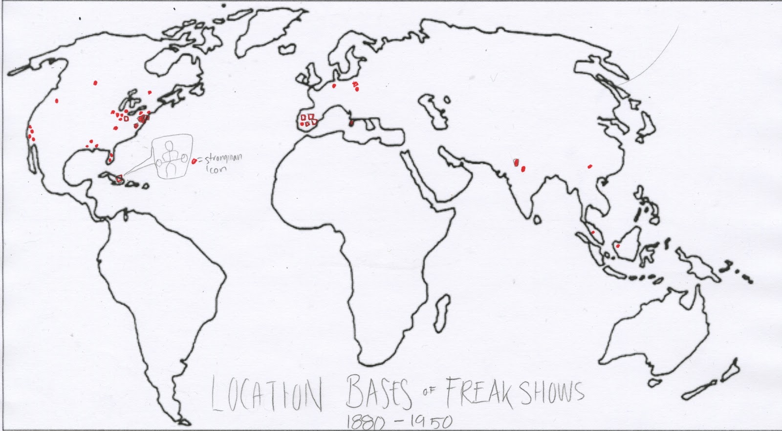
1. sketch one is mapping out where various freak shows originated before they started traveling. The icon used would be the strongman icon.

2. sketch two is showing the most visited cities by freakshows and the different travel patterns in one "show season"

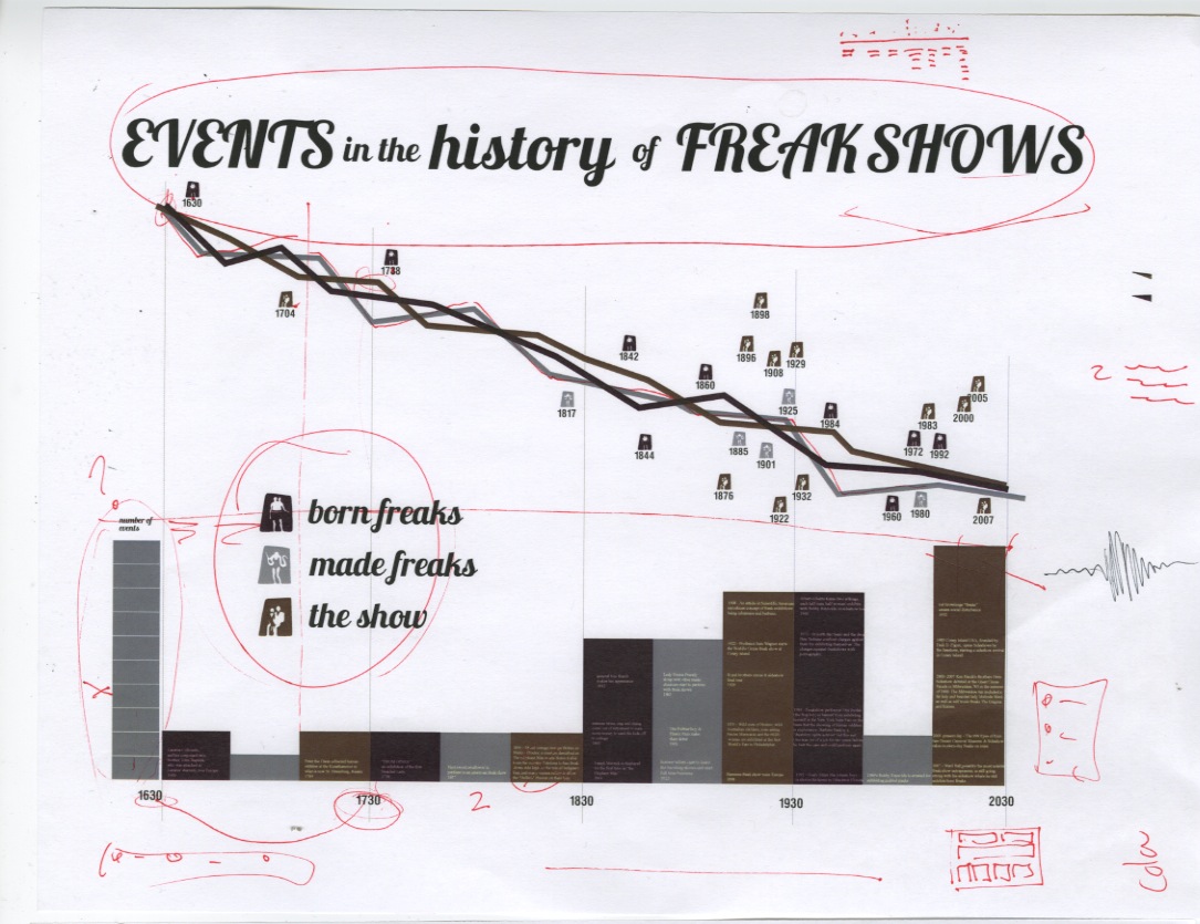
3. sketch three is a timeline of the evolution of the sideshow and how it came to be over time.

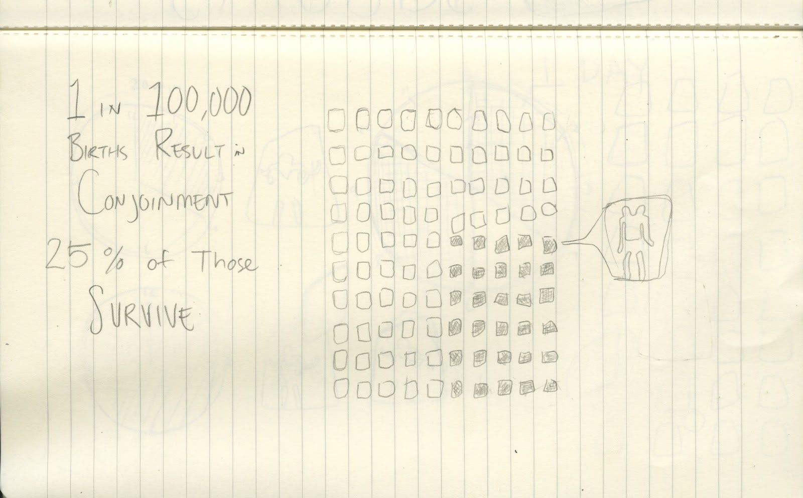
4. sketch four shows the rate of survival in Siamese twins

5. sketch five is graphing the ratio of 1 to 100,000.

6. Types of conjoined twins

7. numbers of swords swallowed at one time by a single performer

8. the rate of survival in siamese twins

9. Performance time. performers go on every 20 minutes. two times an hour. 32 times a day. these are averages.

sources:

http://en.wikipedia.org/wiki/Ventriloquism

http://www.nfa.dept.shef.ac.uk/history/shows/freaks.html

http://www.sideshowworld.com/13-TGOD/ths-tgod.html

http://www.circusinamerica.org/public/transportation_modes

http://en.wikipedia.org/wiki/Conjoined_twins

http://en.wikipedia.org/wiki/Freak_show

http://books.google.com/books?id=hr-9GRxJfPEC&pg=PA51&lpg=PA51&dq=freak+shows+in+1901&source=bl&ots=N3TGBgX9Yw&sig=sQpsCMqsJhPQNkGmOlpYvMveatk&hl=en&ei=ISaETZmjJYaUtwfbg4jdBA&sa=X&oi=book_result&ct=result&resnum=1&ved=0CBgQ6AEwAA#v=onepage&q=freak%20shows%20in%201901&f=false

http://www.lastamericanfreakshow.com/

http://en.wikipedia.org/wiki/Sideshow

http://en.wikipedia.org/wiki/Conjoined_twins

http://www.swordswallow.com/records.php

http://www.swordswallow.com/halloffame.php

http://www.circusinamerica.org/public/structures

Wednesday, March 9, 2011

Icons Final Post

During the process of producing these icons there have been big decisions to make that would inform the icons conceptually. There were three things that needed to be kept in mind while making formal decisions. Legibility, Cohesion, and Culture. I constantly asked myself during the process, "what does this formal decision do for me?" "why does this make sense with my culture?" "how does this reflect my culture?" "can a stranger tell what my culture is without context? with context?" "Is there a level of repetition with variation to create cohesion?"

-Legebility-
To achieve legibility I tried to step back from the work as much as possible and ask studio mates and strangers if they could read the image. Some formal decisions that enhanced the readability were things like the figures being in a larger frame. The icons are based on a principle of complex figure ground relationships. By having larger ground or background framing the figures, there was more contrast, which improved the legibility. Often when the figures were not seen from a straight on view, they became too abstract and obscure. I went through many poses for each performer, trying to find an interesting front view that had a subtle hint towards depth or a 3/4 view. Through out the icons the general rule (with one exception) was to have the clothes bleed into the background color and emphasize the exposed body parts and accessories. The exception to this was the ventriloquist. because there were two figures in the frame it was hard to fully commit to the rule. In order to keep the legibility I left the ventriloquists suit white and the dummy's suit knocked out. As obvious as a decision it may seems, it was a hard decision to commit to.

-Culture-
Reinforcing the culture. Where to start. First off I set up a rule of organic form making. There was a very loose rendering method in the analog stage and an even more liberal method in the digital stage. There have been many words used to describe the icons aesthetic. Words such as wavy, wobbly, wonky, and blurry. I like to refer to the aesthetic as one of a "fun house mirror" effect. I tried as hard as possible to stay away from straight harsh lines where they weren't absolutely necessary. The barbell and the table have the harshest straight lines from a distance. The wobbly nature of the icon set has a feeling of oddity and freakshow-ness. The off kilter frames reinforce the idea of oddity as well. The freak show was also a time for showcase, excitement, and suspense. The angle at which the icons are drawn get at the idea of showcase. they are all set in the act of performing. The frame subtly changing each time creates excitement, visual interest, and rhythm throughout the set.

-Cohesion-
Each icon has a unique frame that is based upon the same shape and size. Each figure occupies about the same amount of space physically and visually. Each icon follows the rule of complex figure ground where the certain elements bleed into the background. Each icon breaks the frame at the bottom with either their feet or the feet of the table. Each one is equally rendered with the same amount of looseness.

Icon Evolution

The full evolution of the Siamese Twin. It started with a drawing from a photograph xeroxed at a high contrast. Then to an appropriation of the image on tracing paper. Then it was scanned in and tweaked digitally in the last five iterations.