Tuesday, September 28, 2010
Monday, September 27, 2010
Color in Image. Both Found and Produced.
Pulling RGB color swatches from album art and converting it to Pantone Matching System. Syntax syntax syntax. The conversion between interfaces is tricky. The colors looked identical on my computer screen but when they were printed a few of the colors were off. The PMS colors were a little more vibrant and bold than the RGB.
Color swatches exemplifying both color harmonies and emotion. Check out the names. We got to name our own colors.
The beginning stages of experimentation with color in photography. The idea is moving in a new direction. Clear glass filled with colored liquids both opaque and translucent. This will be combined with the introduction of lighting both white and colored. Long exposures? double exposure? Mapping? Who knows. More updates to come.
ITTEN color star second appearance
Look familiar? We added some new information. HEX code, Pantone code, and RGB. All of which are converted from CMYK.
Friday, September 24, 2010
Project one. Dot Book.
 |
| alignment |
 |
| proximity |
 |
| continuation, framing |
 |
| scale, continuatioin |
 |
| continuation, proximity |
 |
| continuation, alignment, proximity, scale |
 |
| correspondence, scale, asymmetry |
 |
| continuation, correspondence |
 |
| alignment, framing, symmetry |
 |
| scale, proximity, symmetry |
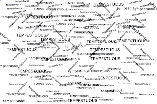
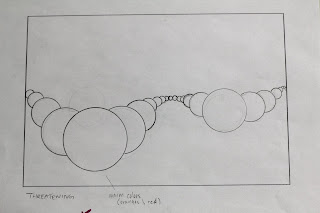
Considering the principles of design, I arranged the dots to convey the word as best as possible. I explored the idea of depth and dimensionality through out my book. If you look to Threat you can see the illusion of depth being exemplified through perspective. Also I used a prominent element is scale as well as proximity. Brewing uses proximity to gather the effect of bubbling upwards. Threatening uses scale to ungulate towards the viewer, crowding their personal space. Tempestuous is in a spiral using scale hinting towards a cyclonic motion of a storm. Alarming is using purely proximity and continuation to exploit the concept of alarming in an abstract but somewhat literal way. Powerful is a large mass engulfing a smaller mass, getting at the point that a hurricane sweeps onto land swallowing everything in its way. Havoc uses continuation and line direction to emphasize these different, somewhat ordered paths intertwining together. Relentless is a composition using framing and scale. Wreckage is showing these ordered units becoming jumbled together as if they have been wrecked. And finally restoration is a circle of dots. It is supposed to exemplify the concept of the coming and going of hurricanes. The rebuilding and destruction cycle. As far as imagery goes, I approached it in sort of two directions. Because of the amount of small dots and intricate I chose to use a lot of line and color. I had a specific color palette in mind. Dim grays and greens with splashes of warm colors to emphasize danger and destruction on top of this looming ominous form. For larger dots I chose imagery that showed the emotion and physical effects that a hurricane causes society. I think as a whole, the book has a flow. It reads nicely page to page with an interesting elegance while the concept is pretty heavy and destructive. To improve the book I feel if I would have had a few more days to push the imagery, the book would be much more powerful. Perhaps tweaking some of my words also. In hindsight I feel that some words are too similar still even through all of the refinement process. Such as powerful and relentless. Both are overbearing and could be mistaken for one another.
Wednesday, September 22, 2010
Monday, September 20, 2010
Color Harmonies
Color harmonies are an essential aspect in design. It is important for us as designers, to understand the relationships in color both in theory and interface. Syntax plays a big part in our understanding of color. cmyk vs rgb for example. They correlate in certain ways and relate but also differ from one another. RGB is additive and CMYK is subtractive. Besides that lets talk about relationships.
1. Complimentary- colors directly across from each other in the color wheel.
2. Spit Complimentary- three colors. two surround the complimentary of the third. ex. red-violet, green and yellow
3. Double Complimentary- two pairs of complimentary colors in one scheme.
4. Analogous- combination of colors spread an equal distance on the color wheel. ex. red-orange, orange, yellow.
5. Triadic- three colors spaced evenly on the color wheel. such as, red blue and yellow.
M O C K up
 |
| brewing |
 |
| threatening |
 |
| tempestuous |
 |
| alarming |
 |
| havoc |
 |
| relentless |
 |
| powerful |
 |
| wreckage |
 |
| restoration |
Where to start. To further solidify our compositions we were asked to make a mock up for a final one on one critique before the book was due. I'm not really sure what to say. I'm sort of a wreck right now as far as organization of thoughts go. This is a mess. I felt like I was going in the right direction after the last critique but after today I'm highly confused. The dot placement in the frame is strong but the imagery is making everything fall apart. I'm not sure what to do or where to go, all I know is I essentially took a step backwards. I've come to find it challenging for myself to successfully use the imagery to my advantage. I haven't found the harmony between abstract communication and literal imagery yet. I don't know if its a refinement issue in my image choice or what. I got some good feedback today but I'm not exactly sure what I'm going to do with it yet. Time will tell. Here are some thoughts on my mind.
1. Brewing- new imagery. making each dot a specific moment.
2. Threatening- clean up the perspective. Introduction of new images with same treatment.
3. Tempestuous- new color palette. more dots. scale.
4. Alarming- crop in tighter into a certain area that is more visually interesting. (see bounding box)
5. Havoc- push scale and image.
6. Relentless- Image change. no masking
7. Powerful- play with angles and color in the mid sized dots.
8. Wreckage- loss for ideas right now. Definitely an image change though. Something more cohesive.
9. Restoration- new imagery. play with the idea of hopeful thinking. optimistic. go from a eroded dot to an image of constructionPerhaps I should con cider the emotional qualities of a hurricane. approach these compositions in more of a humanist way rather than repeating the fact that its a hurricane. My type says hurricane, my dots say hurricane, my images say hurricane. Maybe, well definitely, its too repetitious. If I make my imagery less supportive and more altering I think I will be in a good place.
We will see where this goes. Pushing myself out of the "obvious" is the toughest part. My idea of literal is a bit different than Jamie's. Lets see if I can get on her level. I'm pretty bummed about how bad a review this got but I'm trying to stay optimistic and fix the void in my book. Don't trip, get hip.
Sketches
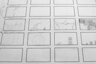
Sketches for the final nine words. Brewing, Threatening, Tempestuous, Alarming, Havoc, Powerful, Relentless, Wreckage, Restoration. My main concern was making the book as a whole have continuity in the level of depth, elaboration, and spacial relationships. I'm nervous about the really small dots. I have to figure out a clean way to get the massive amounts of small dots. After one on ones with Jamie I'm feeling pretty confident in my final composition templates. Now the area of concern is IMAGERY. More blogging to come on these compositions.
Conceptualizing
Thumbnails. Here is an update on some process for the image book. Mass producing ideas and then stepping back really helps. I feel like I am beginning to exhaust the obvious, moving towards stronger compositions.
Subscribe to:
Comments (Atom)


