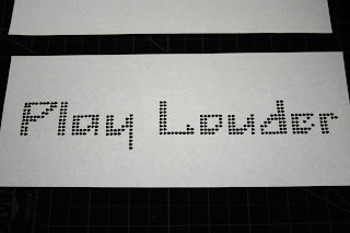
More process on the bitmap fonts or "pixel type." The unit of measure for the type face are guitar picks. As far as process goes, the letters are composed on a grid then photographed. Then they are edited (cropped and color corrected) and placed together to make the words. One lowercase. One all Caps. One in title case. I chose words that related to the object without being to literal but maintaining a level of understanding. In other words the word choice couldn't be too much of a stretch. I was focused on making the type revolve around reoccurring shapes in its most basic form. The image at the top will help in understanding what I'm talking about. The square represents the amount of space given for each composition. the curved area combined with the right angle is the shape that the font revolves around. It is most evident in the A, B, G, E, C, D. If you flip the shape upside down you are left with the shape of the P, a, O, o, d, e. After critique I realize that there may be continuity through out the typeface but so much that each idea fights. There seems to be a struggle between the direction of the curves in the P like shapes and the direction of the A like shapes. It may just be the letters within PERFORM fighting and may not be problematic in the typeface as a whole. Also it could be due to kerning. On another note I enjoy the peaks and valleys created by my font. For some it may be a struggle that distracts and skews legibility, but I find it pleasing. All in all I have some resolving to do in my font.


No comments:
Post a Comment