Friday, April 8, 2011

Wednesday, April 6, 2011

final neville brody poster

infographics: meeting objectives


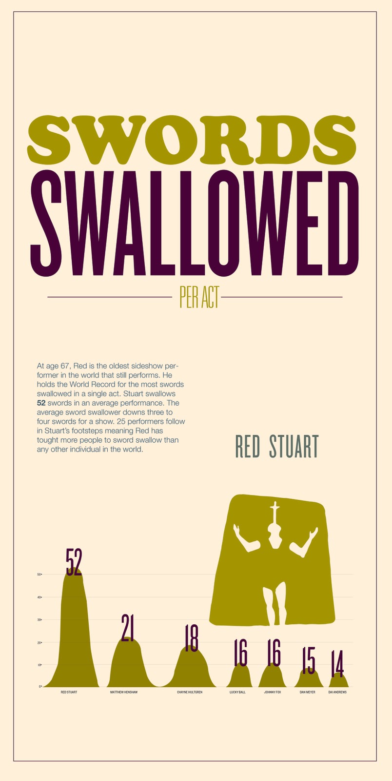
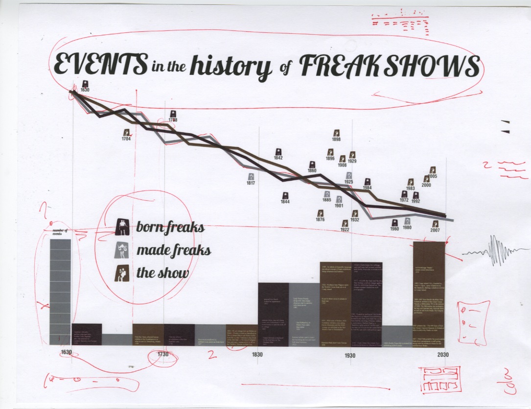
Info-graphics revolve around information. The core of an interesting information graphic is interesting information. Seems obvious and easy but its actually quite difficult. A lot of research was required before aesthetics could even be considered. I struggled with the research a bit towards the beginning. I searched high and low for good information but the cultural time period is talked about so vaguely and generalized so much that quantitative information often was non apparent. It was suggested that I start looking at qualitative information and trying to visualize that before jumping into numbers that did not exist. Needless to say, after a long journey I finally found the information I needed. As far as visualizing the information goes, I considered a lot of variables. The info graphics shown above have evolved formally and conceptually a great deal since the beginning. It was hard to find the balance between aesthetically pleasing decisions and informatively confusing decisions. The best thing I could do was keep it simple until the information was visualized as clear as possible to me while considering the minds of others. Then I emphasized hierarchy through color and type scale and weight. The aesthetic decisions made in color palette and typefaces were made to reinforce my culture without being overly obvious or cliche. For instance using rosewood, or some crazy intricate decorative typeface would be directly pulled from a sign of the time or from the convention and stereotypical "look" of freak show typography. Rather I wanted to reference the time period and wonky nature of a carnival/ freak show while adding a bit of my contemporary aesthetic. Thats where the combination of a condensed sans serif comes in. The condensed sans serif in combination with the rounded type and the heavy slab keeps the typography visually interesting while conceptually getting at my culture.

Monday, March 28, 2011

Infographics: aesthetics round 1


Book Cover Sketches

series 1

series 2


series 3

series 4

series 5

mapping ideas


1st concept, revised

second concept, revised
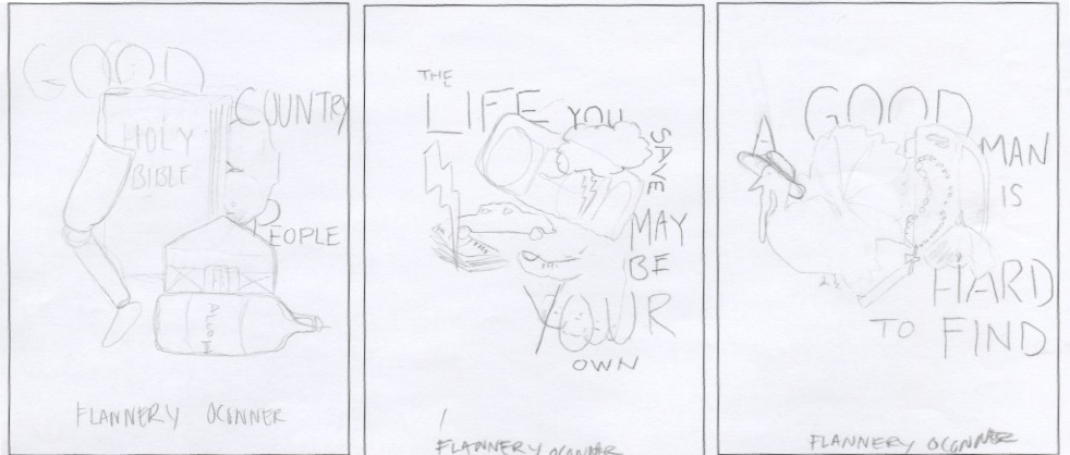
Flannery O'Conner short stories. The covers will eventually be designed as iPad & e-reader cover pages for the books. They are based on three stories. Good Country People, the Life You Save May Be Your Own, and A Good Man is hard to find. Through out the series of short stories there are underlying themes of religion, deceit, and Hypocrisy. Playing off of those ideas I am focusing my covers on dualities. some are more ironic than others but the concept is based on the ideas of things not always being what they seem. Theres a selfish christian, a loner that rejects redemption, and a scholar that is robbed.